ROGOHA AI Visibility & Digital Image Studio Website Rebuild
ROGOHA came with a clear vision: a site that looked as sharp as the work they do. I moved them off an outdated Weebly platform onto a custom WordPress build — seven pages, a bold dark aesthetic, and a design system built to make every visitor feel like they're in good hands.

Before: A Weebly site that didn't reflect how good ROGOHA actually is — generic layout, no real visual identity, and a mobile experience that felt unfinished.
After: A custom WordPress website with a strong, dark premium aesthetic. Seven fully designed pages, a consistent brand identity with crimson used intentionally throughout, smooth animations, and a mobile experience that works properly on every device.
A brand with no website to match it
ROGOHA does work at the intersection of AI and visual identity — two fields where perception matters enormously. But their website wasn't keeping up. It was built on Weebly, felt dated, and gave no real sense of who they are or what they're capable of.
The goal wasn't just a new platform. It was building something that felt as intentional and sophisticated as the studio itself — a site where a potential client lands and immediately understands they're dealing with experts. Every page needed to carry that same energy, from the homepage right through to the contact form.
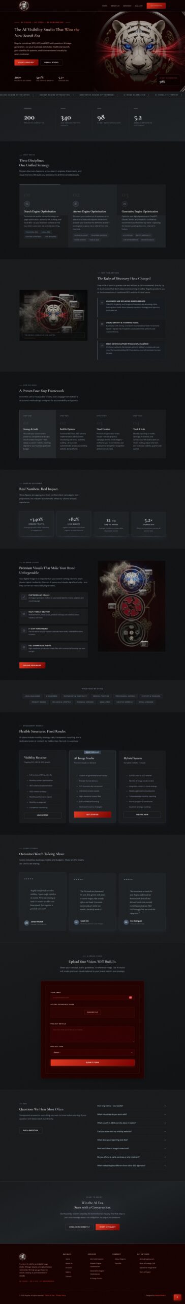
Seven pages. One cohesive identity.
The visual foundation started with a deep, near-black background that makes everything on the page feel intentional, paired with a warm silver tone for body content that's easy to read without being harsh. The brand's crimson colour was kept for the moments that matter most — the navigation, the footer, buttons, and the top of every page — so it always lands with impact rather than blending into the background.
The content areas across the site were unified into a single cool-grey palette, giving the whole site a calm, sophisticated feel that lets the crimson do its job. The result is a site that looks designed — not assembled.
All seven pages were built to the same standard: Homepage, About Us, Services, Gallery, Contact, Terms of Use, and Privacy Policy. Each one carries the same design language, the same animations, and the same attention to how it feels to scroll through on a phone versus a desktop. The mobile navigation — which had been unreliable — was rebuilt from scratch to open and close cleanly on every device.
Contact forms on both the homepage and the contact page were styled to sit naturally within the dark aesthetic, so they feel like part of the design rather than a third-party widget dropped in. The footer includes a dedicated legal section linking to both policy pages, keeping the site professional and complete.
WordPress
7 Pages
Weebly → WP
Cormorant Garamond + DM Sans
Dark, deliberate, and detail-driven
The dark aesthetic wasn't just a style choice — it was a strategic one. In a space where most competitors default to white and light grey, a rich, near-black foundation immediately sets ROGOHA apart. It signals confidence, expertise, and seriousness without saying a word.
Colour was used sparingly on purpose. The crimson brand colour appears only where it genuinely needs to — navigation, the footer, buttons, and page openers. Everywhere else, the content sits in a calm, unified grey tone that lets visitors read and absorb without visual noise competing for their attention. The result is a site where every red element feels like a decision, not decoration.
Subtle texture and animation bring the whole thing to life without being distracting. Content fades and rises into view as you scroll, giving the pages a sense of polish and weight. The overall impression is a studio that takes its craft seriously — which is exactly the message ROGOHA needed to send.
A site that earns the first impression
ROGOHA now has a website that reflects exactly who they are. A visitor landing on any page of the site gets an immediate, consistent sense of the brand — confident, precise, and forward-thinking. There's no page that feels like an afterthought.
- Moved off Weebly onto a fully custom WordPress site with room to grow
- Seven complete pages — Homepage, About Us, Services, Gallery, Contact, Terms of Use, and Privacy Policy — all built to the same design standard
- A bold, dark aesthetic with the crimson brand colour used intentionally so it always makes an impact
- Mobile navigation rebuilt to work cleanly and reliably on every phone and tablet
- Contact forms on the homepage and contact page styled to feel native to the design, not tacked on
- Smooth scroll animations that give the site a polished, considered feel throughout
- Works seamlessly across all screen sizes — desktop, tablet, and mobile
- A complete site that's professional end-to-end, right down to the legal pages in the footer
 Scroll ↓
Homepage
Scroll ↓
Homepage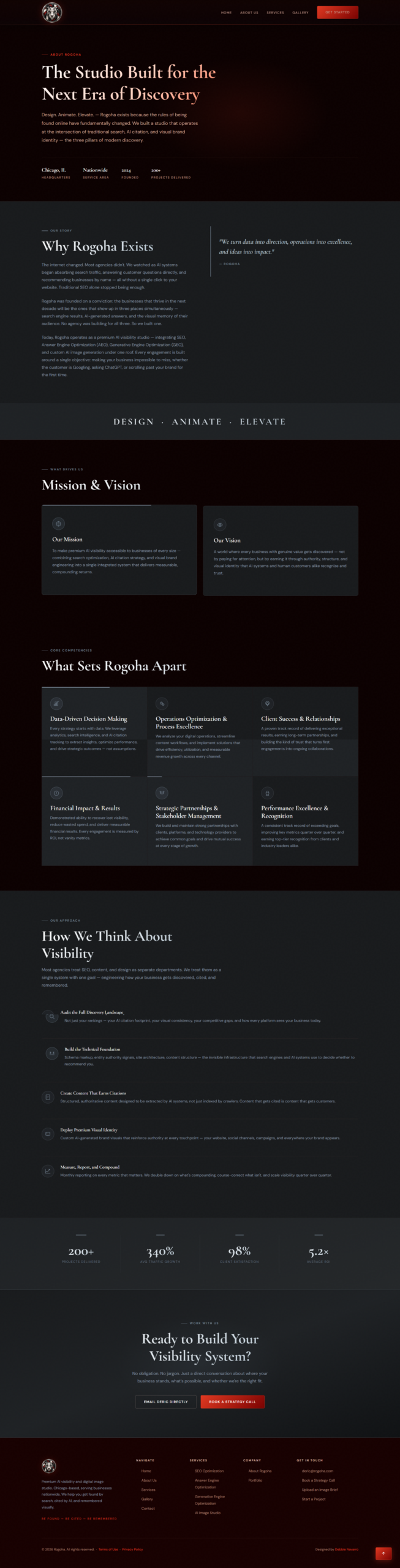 Scroll ↓
About
Scroll ↓
About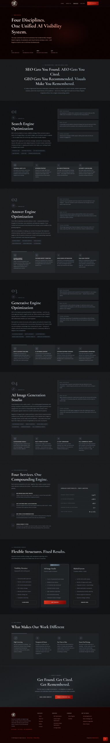 Scroll ↓
Services
Scroll ↓
Services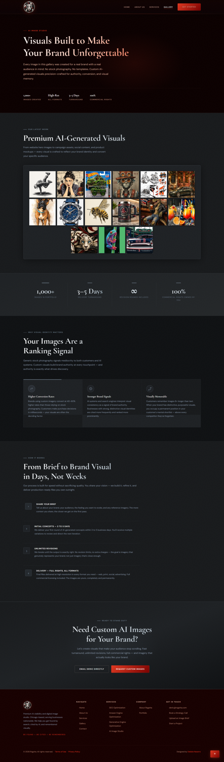 Scroll ↓
Gallery
Scroll ↓
Gallery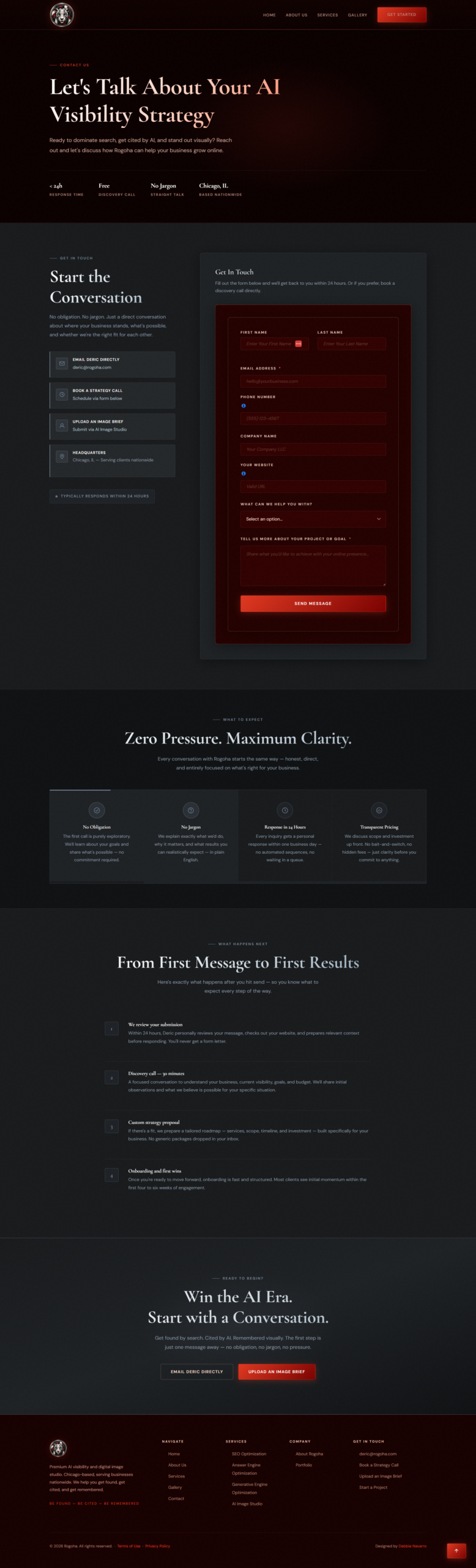 Scroll ↓
Contact
Scroll ↓
ContactNeed help with your website?
Whether it's a full WordPress rebuild, Weebly to WordPress migration, complete redesign, or finally fixing that broken thing — let's talk about it. I specialize in transforming outdated sites into modern, professional digital experiences.